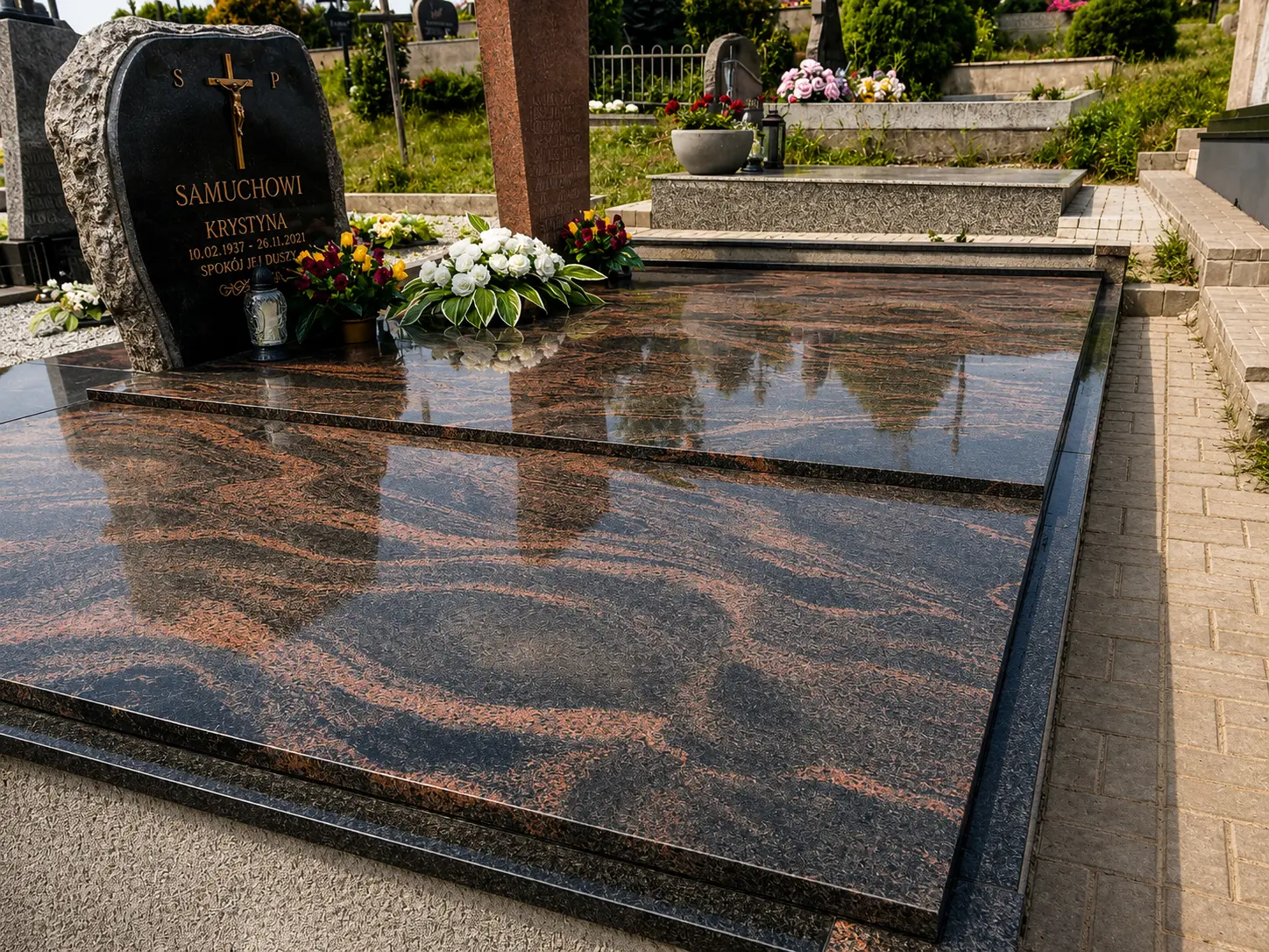
Colour establishes the character
Black granite creates a precise, restrained background and strong contrast for light lettering. Grey feels softer and often sits naturally beside planting. Red and brown tones introduce warmth and make the stone pattern more visible.
View samples in daylight whenever possible. The same stone changes in sun, shade and rain, and a small sample may not reveal the movement of a full slab.
- Black: clear form and strong lettering contrast
- Grey: a softer, more natural character
- Red or brown: warmer colour and a more expressive pattern
Polished, matte and textured surfaces
Polishing deepens colour and reflection and is easy to wipe, although water marks and dust remain more visible. Matte or textured areas absorb light, feel quieter and may be more practical near the approach.
Several finishes can be combined within one composition, for example a polished inscription field with a restrained textured accent.
- Consider grip in access areas
- Give inscriptions clear contrast
- Use finish changes to create hierarchy, not excess decoration
Compare the complete composition
Compare more than stone samples. Consider the amount of slab surface, monument silhouette, inscription, and places for flowers and candles. A dark stone used over a large area can feel heavier than the same colour in a small sample.
When combining stones, decide which one is primary. The second should improve form or readability rather than compete with the name.
- Ask to see a larger slab or completed project
- Test inscription contrast
- Discuss care through different seasons